Textblock
A javascript tool for adjusting size, leading, and grades to cast continuously responsive typography. It works over your current CSS as a progressive enhancement.

A javascript tool for adjusting size, leading, and grades to cast continuously responsive typography. It works over your current CSS as a progressive enhancement.
This page was set using Textblock. Adjust your viewport width – or device orientation – to see it in action.
Textblock calculates your setting based on minimum and maximum values for font size, line height, variable grades, and container width:
Textblock([{
target: ".some-element"
}]);
For a better sense of context, set your root em to 10px with html { font-size: 62.5%; }. This makes your em units base 10 so 2.4em = 24px. But any number will do because once you start adjusting the min/max numbers, the experience is more visual than calculated. And if you prefer a more scientific approach, textblock gives you the control you need for setting systems like modular scales.
If you’re using variable fonts, the minWidthVariableGrade / maxWidthVariableGrade parameters provide a way to simulate grades (micro-variations in weight to set smaller sizes slightly bolder).
Textblock([{
target: ".some-class",
minWidth: 280,
maxWidth:
800,
minWidthFontSize: 1.9,
maxWidthFontSize: 2.6,
minWidthLineHeight:
1.33,
maxWidthLineHeight: 1.25,
minWidthVariableGrade: 366,
maxWidthVariableGrade:
300,
container: "self",
units: "rem"
}]);
Textblock([
{
target: ".some-class",
minWidthFontSize:
1.9,
maxWidthFontSize: 2.6
},
{
target: ".another-class",
minWidthFontSize:
2.4,
maxWidthFontSize: 3.6,
minWidthVariableGrade:
450,
maxWidthVariableGrade: 400,
container: "self"
}
]);
Get type news from Glyphic. Your info will be safe and we’ll never spam.
Textblock is released open source and licensed under MIT.

Coming 2026: Typographic curiosities sent daily to your inbox.
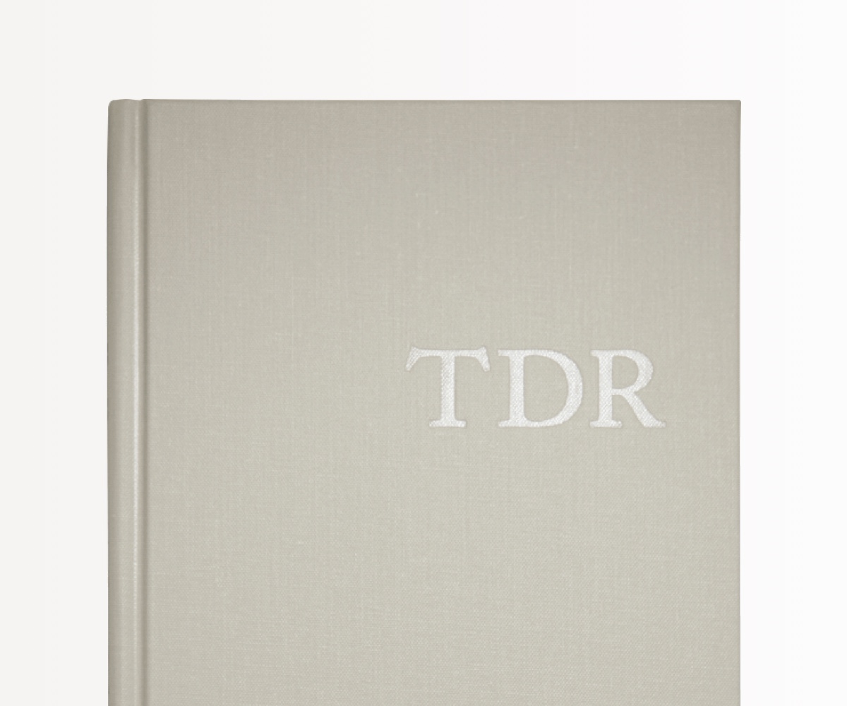
The Typographic Desk Reference (TDR) is an encyclopedia, listing countless entries on the
typographic arts.
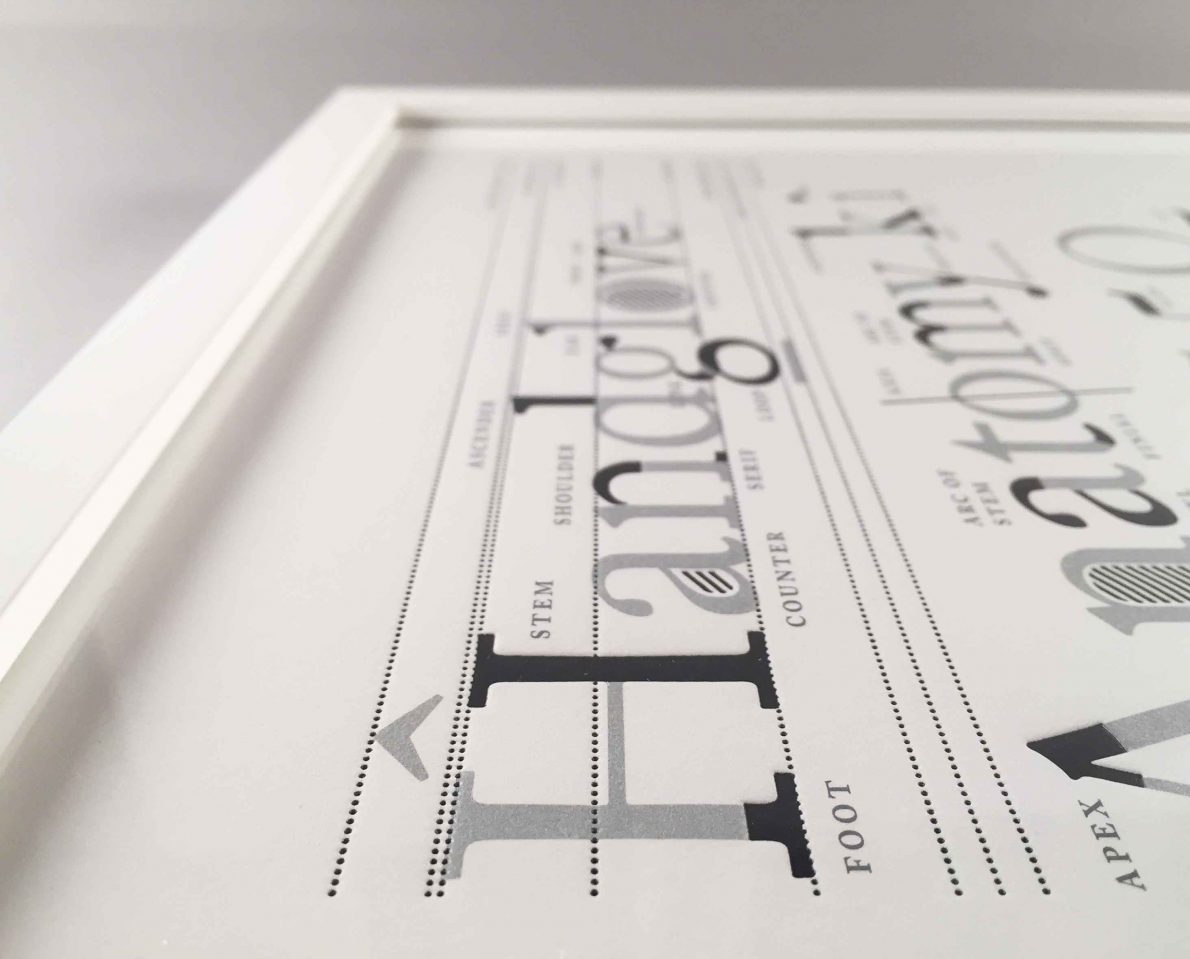
A handmade print of the anatomy diagram from the Typographic Desk Reference, printed
four colors, offset & letterpress, in a limited edition of 333.